Votre panier est vide.
Aequivalent
I created three different interfaces for the background check company Aequivalent.
For confidentiality purposes, some names, data and information have been changed.
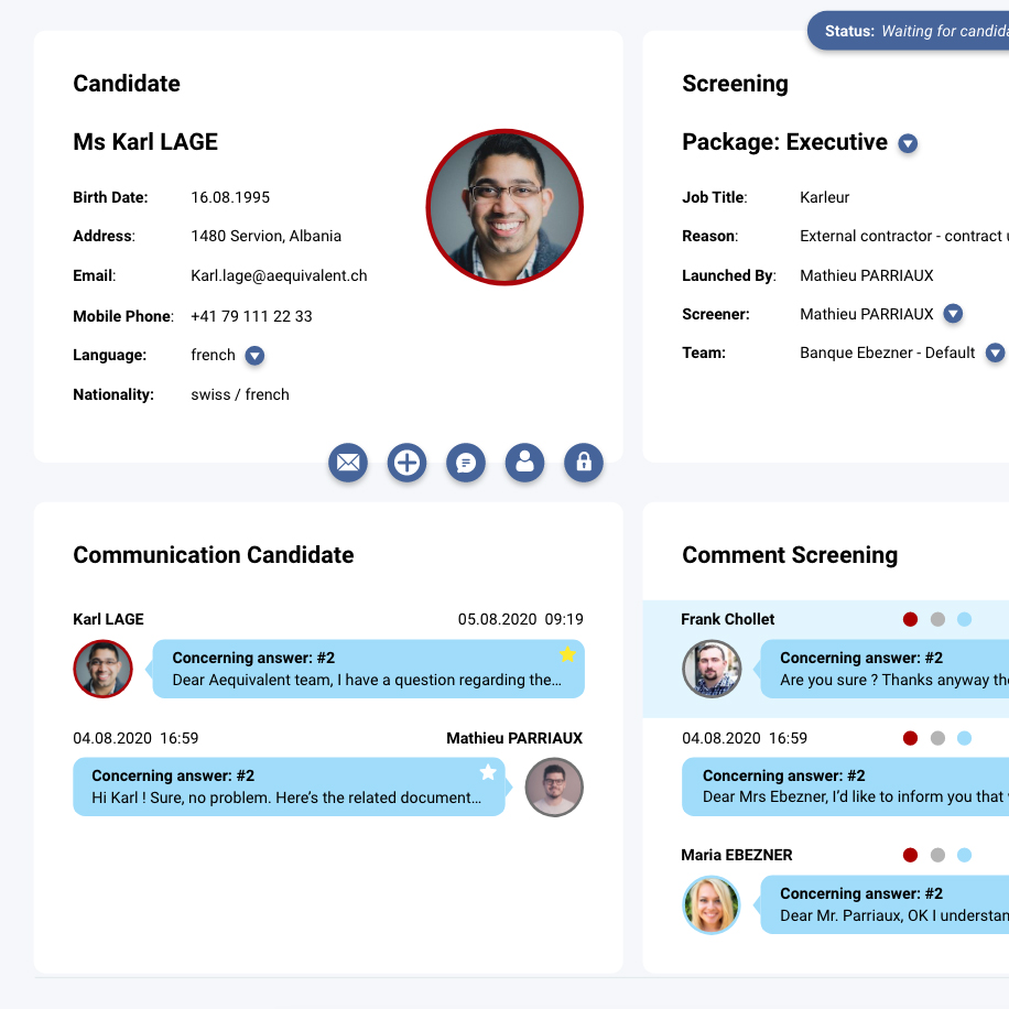
Creating three different platform interfaces
Sneak peak inside the interfaces. Scroll down to get more insight.
Meet
The client
Aequivalent SA is a company which performs background checks.
It basically provides employers verified data on potential future employees by performing a "screening".
This involves providing a candidate, a client and the company three different interfaces which I've designed:
- The candidate interface (job seeker)
- The client interface (hiring company)
- The company (Aequivalent)
Chapter one
Think
Bringing the team together
From V1 to V2
The team and the improvements
To start with, we brought the team together, with all the important stakeholders.
The company already had a functioning V1 that needed some redesign and some restructuring.
The V2 needed several new features in order to provide a better experience, but also better functionalities to different types of users.
From V1 to V2: Historical data and previous iterations
The company already had a V1 and they made a few tests and collected data. So, I didn't got involved in a lot of testing in this work.
But in order to create a better V2, a lot of restructuring had to happen. Thanks to the company feedback from current customers, I was able to get a good understanding of the improvements needed.
Making the product better
What are we going to improve ?
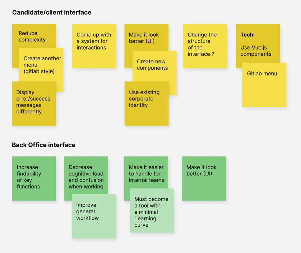
Selecting the key elements to improve
We had agreed on a couple of changes that needed to be made.
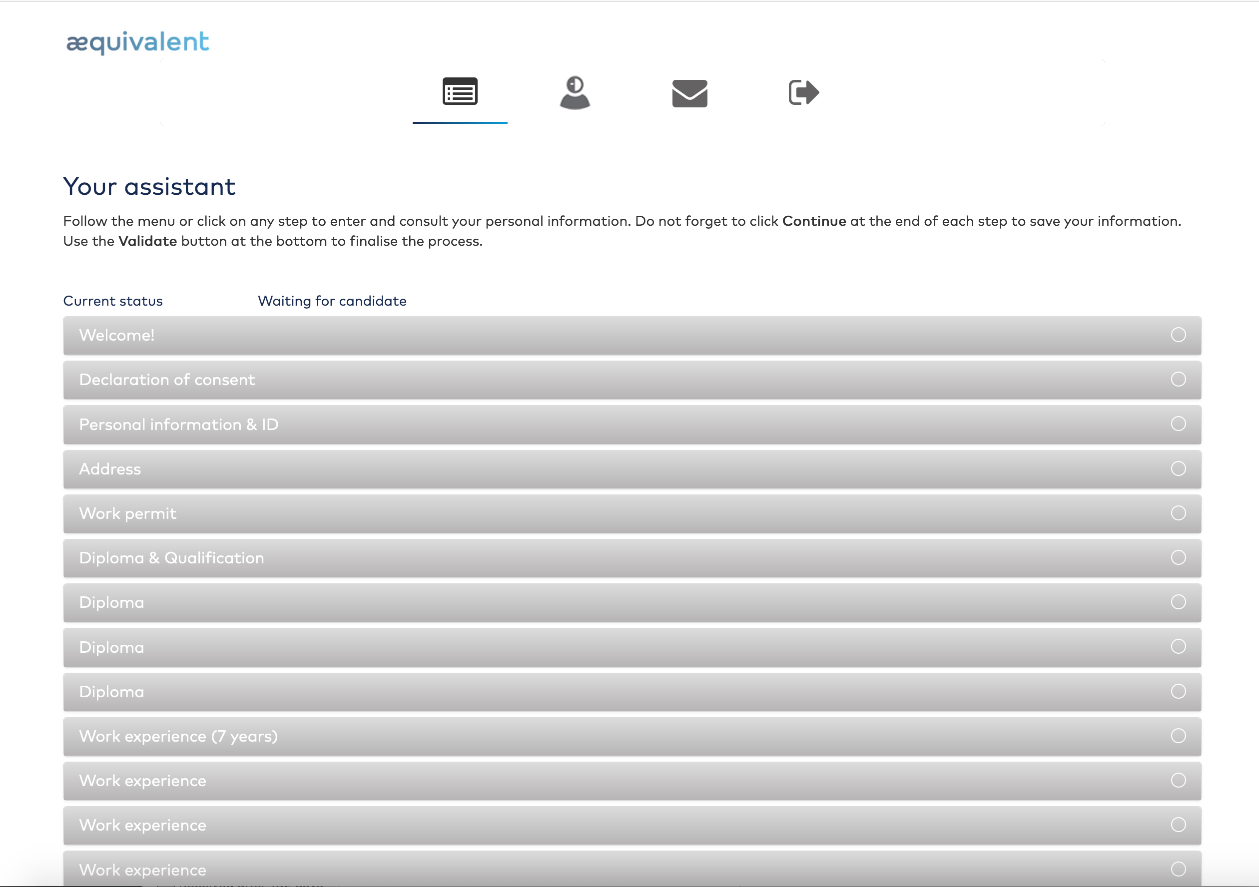
The candidate interface required many fields to be filled. These fields where grouped in different "steps".
In fact, one of the most challenging things was to deal with all this complexity and all these steps.
In the back office interface, I had to reorganise everything different to make things easier to understand and to work with.
Decisions made to design the V2
The candidate/client interface:
- Create another menu to increase clarity
- Display error/success messages differently
- Come up with a system for interactions
- Make it look better
The back office interface:
- Increase findability of key functions and improve workflow
- Decrease cognitive load/confusion when working
- Make it look better and easier to handle
Before we start making, let me present you the V1 (candidate interface):
Chapter two
Make
Starting with the candidate/client interfaces
Gathering ideas and inspiration
Starting from scratch is stupid.
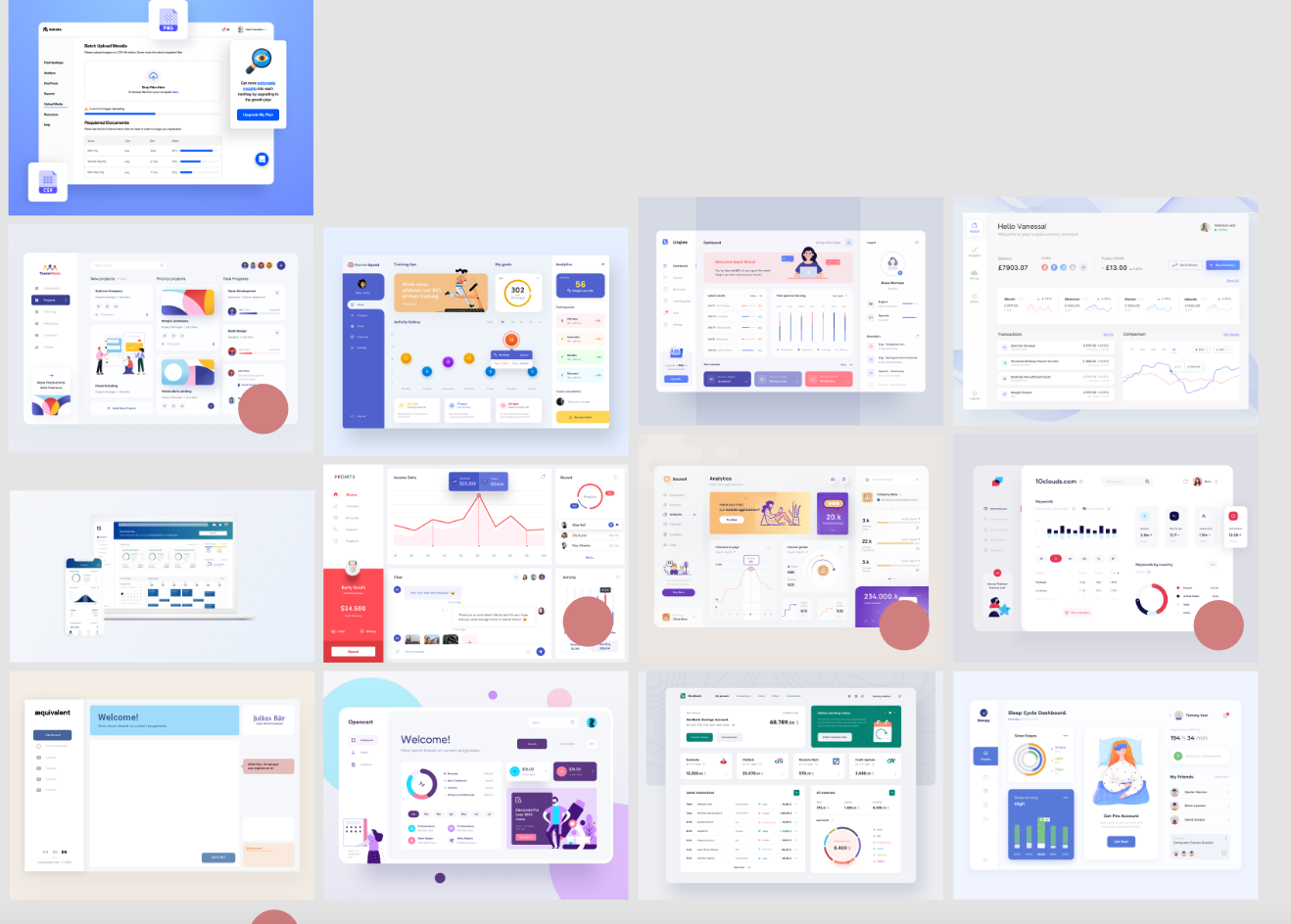
I've checked what has been done on other interfaces in order to gather different ideas on how to structure this candidate/client interface.
I believe starting from scratch is stupid. By selecting different concepts from the start, it allowed me to work much faster and find a solution for the general structure of the interface.
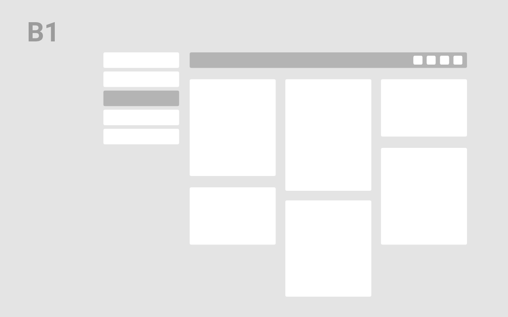
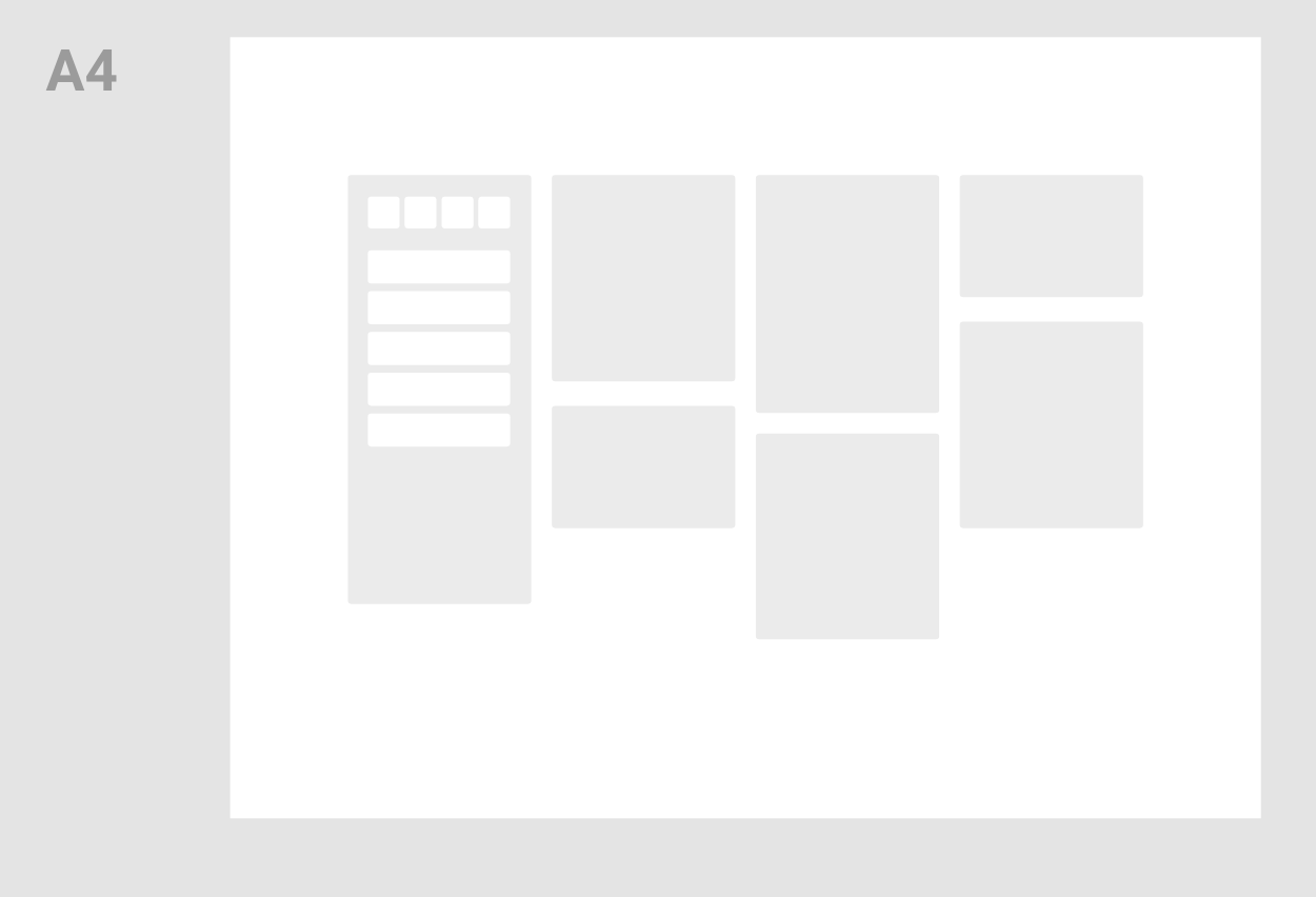
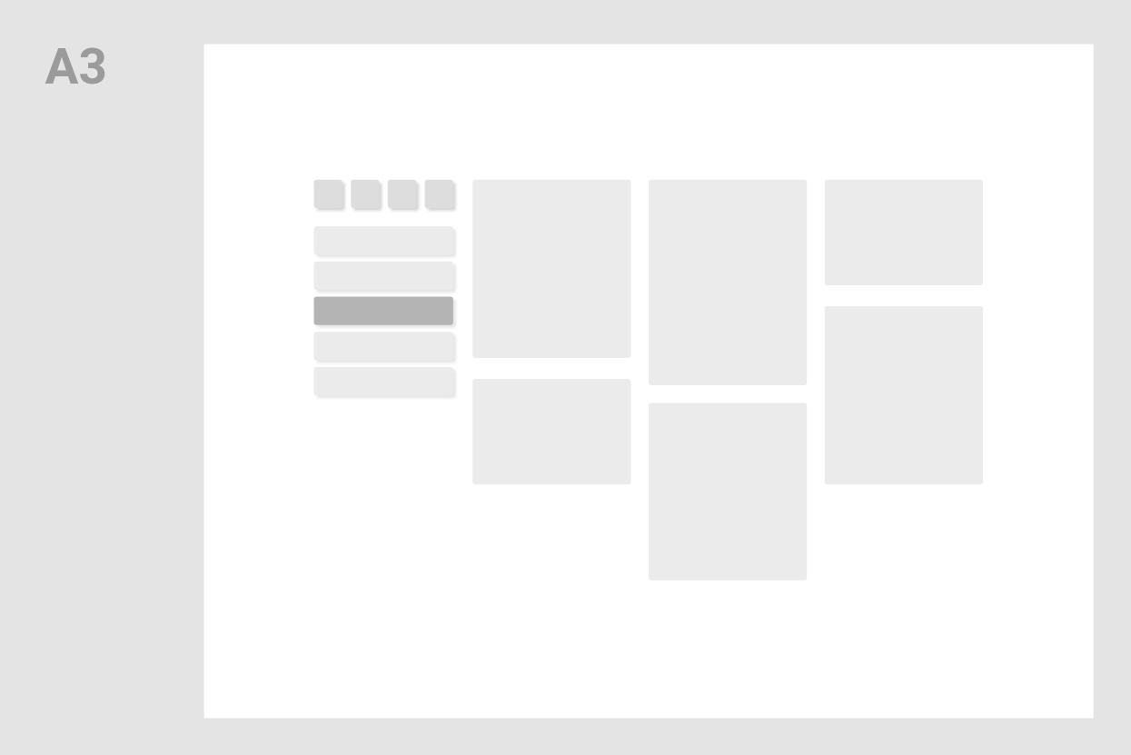
Form follows function
Creating the best structure for the purpose
The goal of this new layout is to:

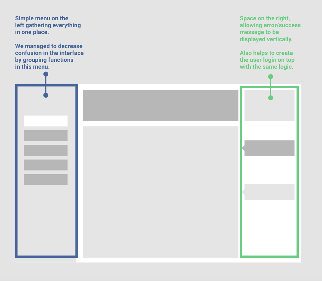
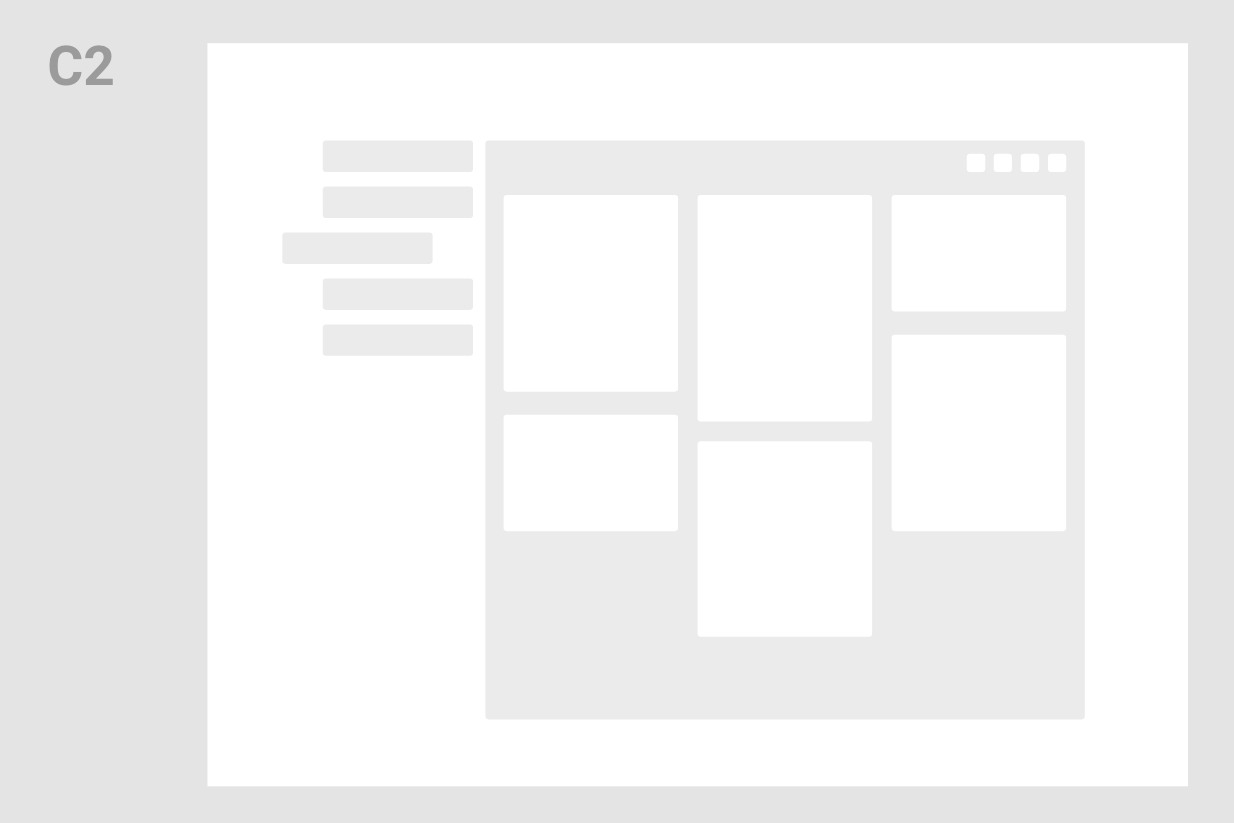
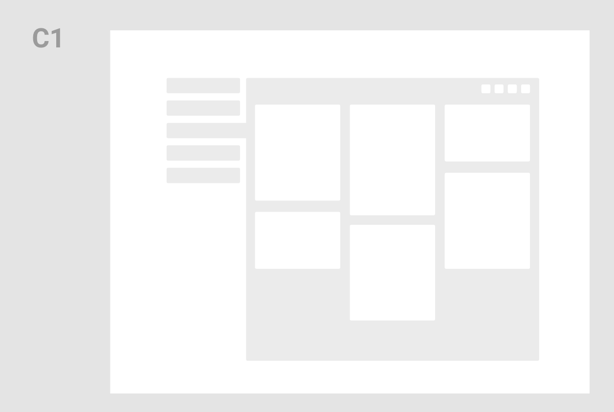
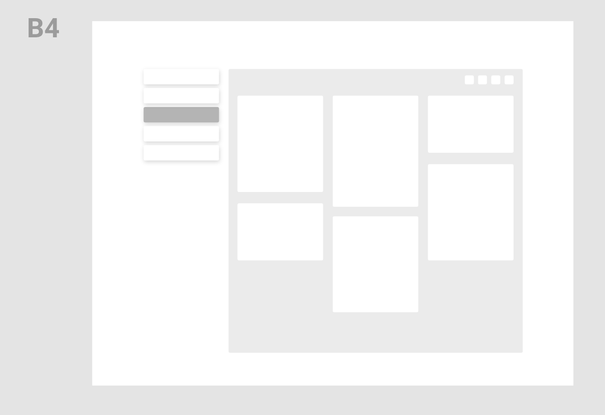
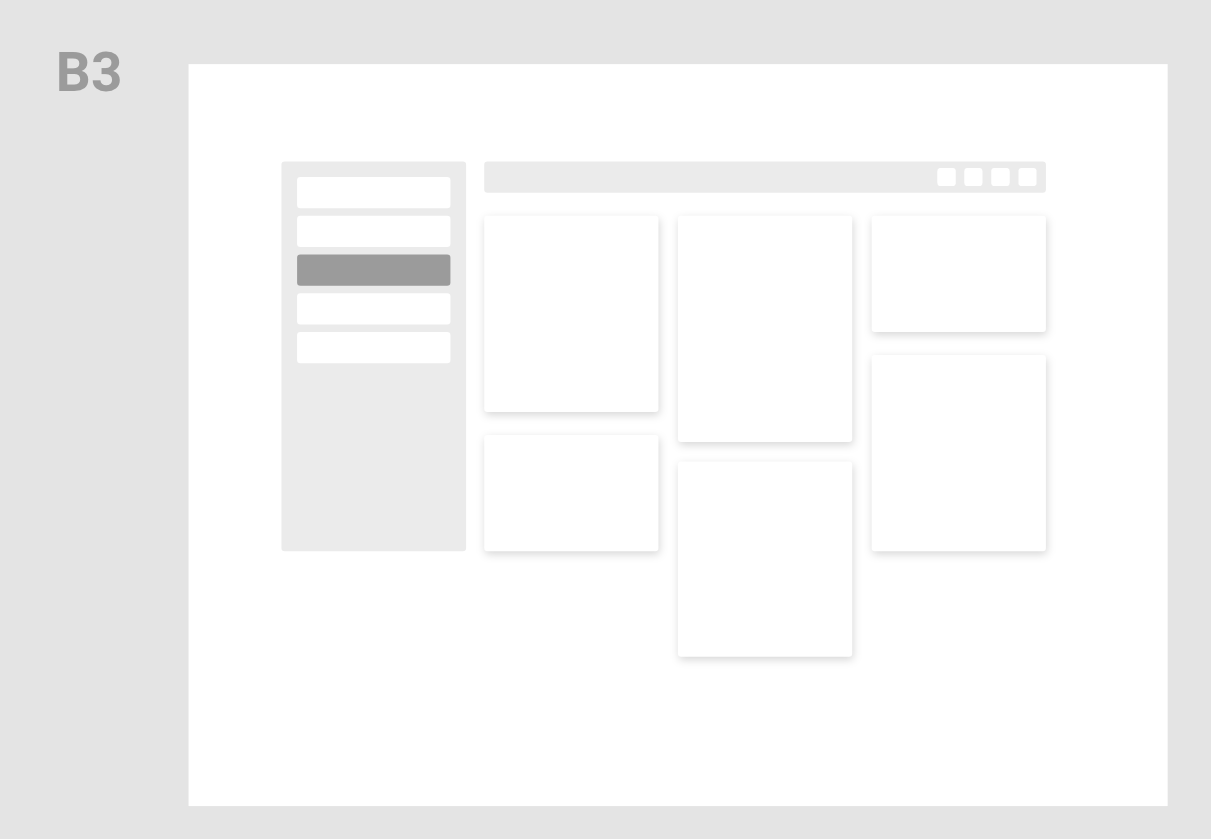
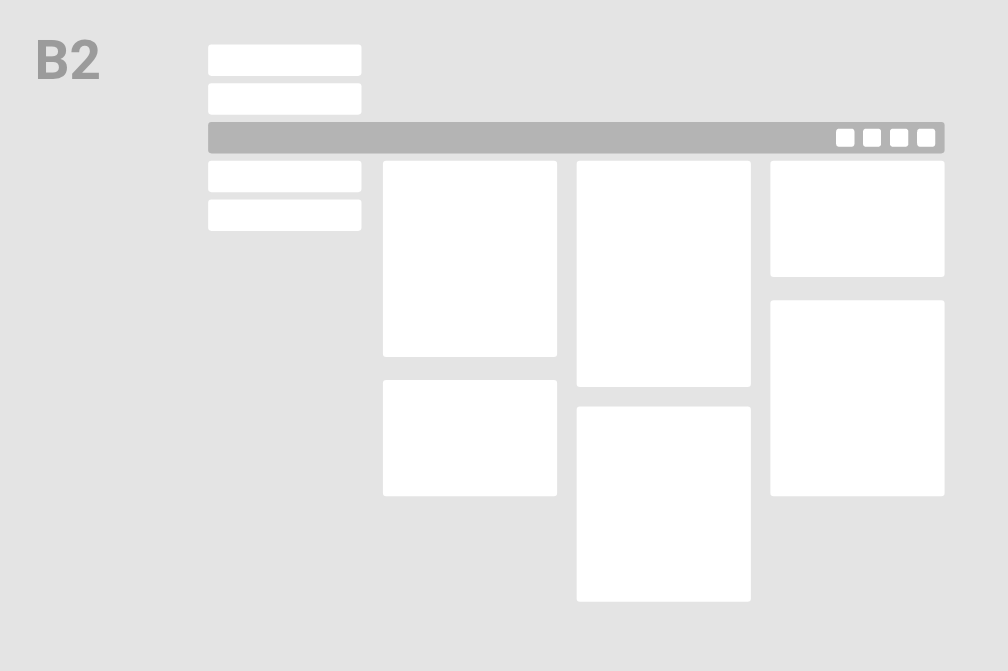
The back office interface
Generating different structures
The goal of this new layout is to:

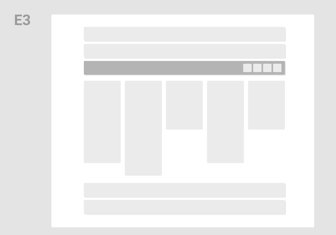



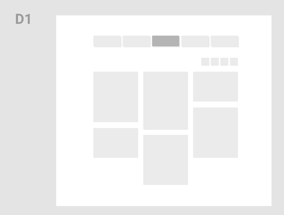
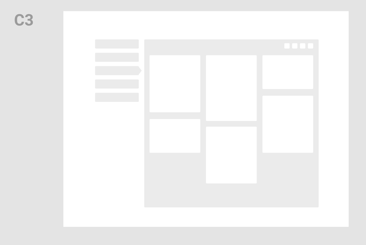


“
“I recommend Jerome as a UX/UI designer. He listened carefully to our needs and proposed practical solutions to complex problems. It was a real pleasure to work with Jerome!”
Joël R., IT & Project Manager
Bringing it to life
The candidate interface

Checking the details
Let's zoom in
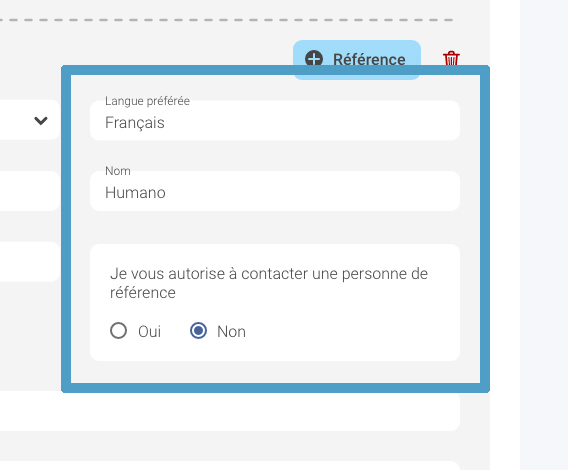
Interactions: Grouping elements + Add/Remove buttons

Interactions: Drag and drop space + Compact/simple document element
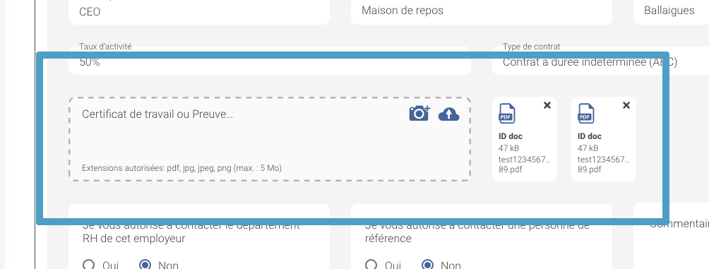
For Developers: using Vuetify elements to save time and implement faster
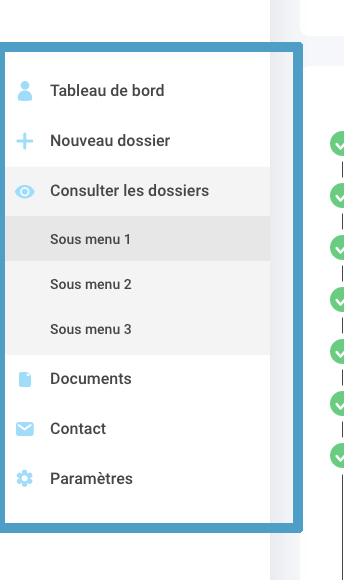
Menu: it wasn't 100% clear at the beginning whether or not the menu will contain a lot of interactions or not. As we evolved, the menu got bigger. We decided to use simple a dropdown menu to fill more functions into it
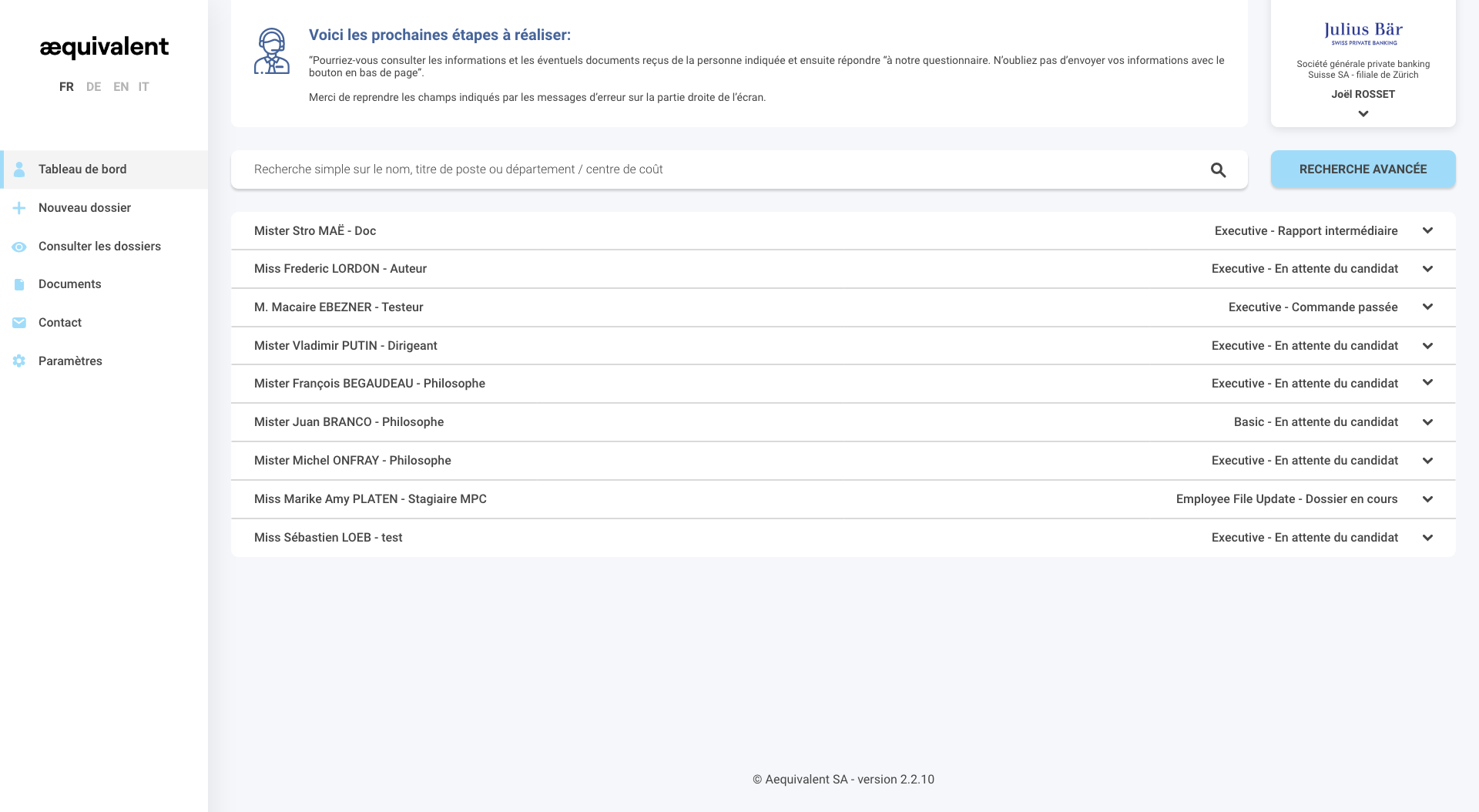
Bringing it to life
The client interface
Using the same structure than the candidate interface:
With menu open: allows the recruiter to easily switch between companies

Bringing it to life
The back office interface
Back office: screen 1 (top)

Back office: screen 2 (bottom)
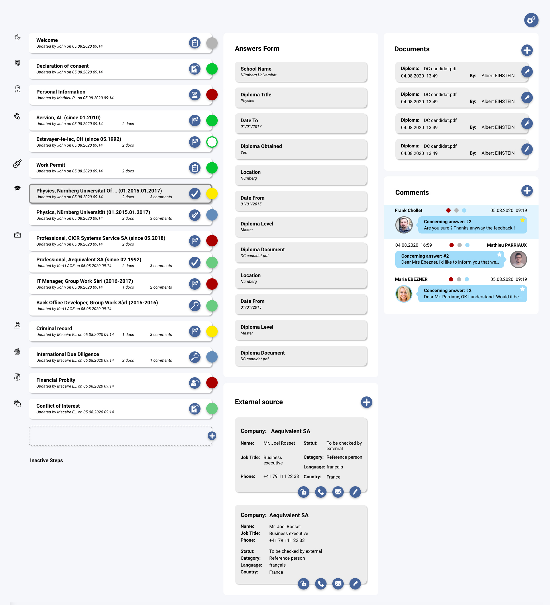
Checking the details
Let's zoom in
Interactions: Buttons are slightly offset to highlight the functions. This creates a design system, consistent throughout the back office interface.
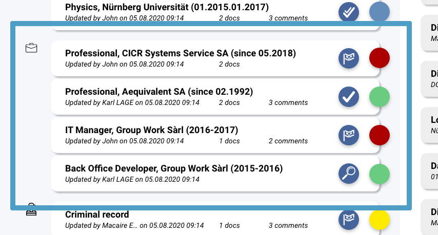
Interactions: this is one of the major changes from the other interface. The "Steps" are opened/closed on the right of the screen. The "Steps" appear on the left. This allows to save space and make it easier to use.

Design: I created a design system for 2 things: the status and the result. The status (icon) and the result (coloured sticker) need to communicate different things to the worker.
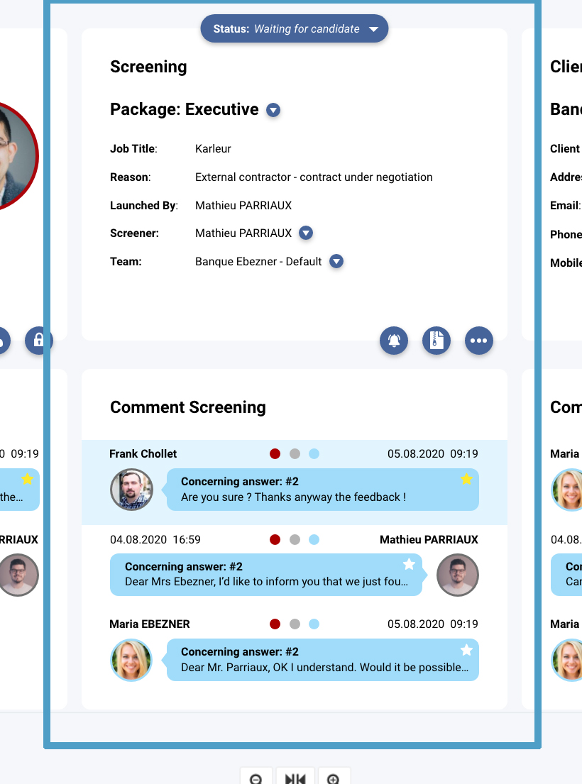
Structure: Each column and each row are related vertically, and horizontally. This creates 3 different themes: "Candidate", "Screening" and "Client"
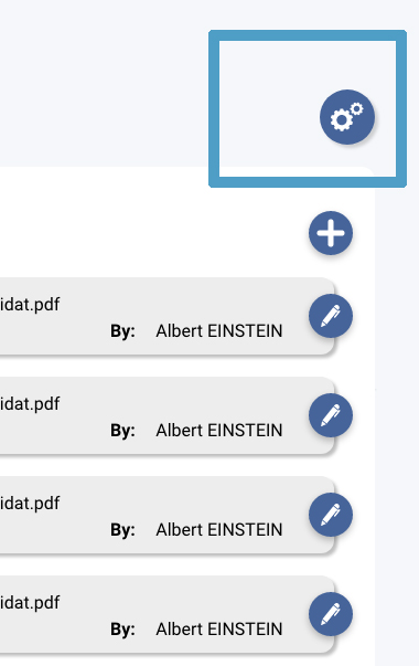
Interactions: it appear extremely simple here, but this button was part of the structural change of the entire entire. It allows generic functions to be applied to everything underneath it.
Bringing it to life
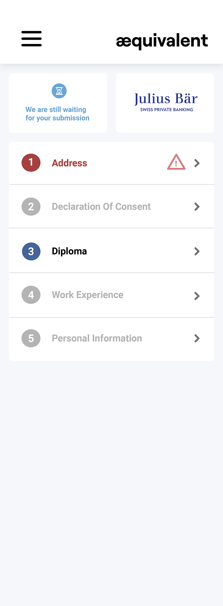
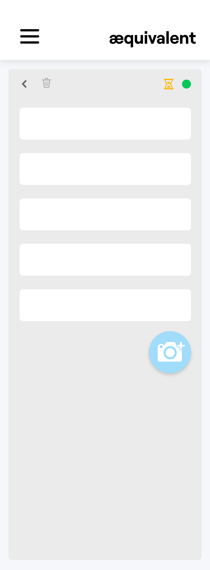
The mobile interface
The mobile interface was just a tiny part of the work.
I haven't spent much time on it.
Chapter three
Check
Think, Make & Check
Check for improvement
Reviewing my goals
Earlier in the project, I decided to set the following goals:
The candidate/client interface:
- Create another menu to increase clarity
- Display error/success messages differently
- Come up with a system for interactions
- Make it look better
The back office interface:
- Increase findability of key functions and improve workflow
- Decrease cognitive load/confusion when working
- Make it look better and easier to handle
Have I met these goals ?
In my workflow, I usually like to measure things or set things up in a way I can analyse the performance of the new design. This wasn't the case in this project.
However, I would like to be able to check with the company - in a year or so - how users have enjoyed the change from V1 to V2 and make adjustments to it if necessary.
I hope to have the chance to take part in the V3 of the project ;)
See you soon,
Jerome


